


Football
Share
Published 12:21 9 Mar 2015 GMT
Updated 00:34 10 Mar 2015 GMT
Explore more on these topics:
 We looked at 10 other classic crests that we would love to see make a comeback.
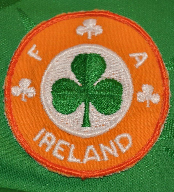
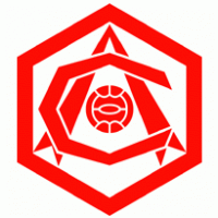
1. Ireland
The current version is fine, featuring a nice mix of green, and a football that looks like Pablo Picasso might have designed, but it's missing one vital detail. Where's the shamrock?
Current:
We looked at 10 other classic crests that we would love to see make a comeback.
1. Ireland
The current version is fine, featuring a nice mix of green, and a football that looks like Pablo Picasso might have designed, but it's missing one vital detail. Where's the shamrock?
Current:
 2. Liverpool
The current version of the Liverpool crest, though a hark back to the old days, is bare in comparison to the one introduced for the club's centenary in 1992.
The previous version features not just the Liver bird, but the club's famous slogan, the Shankly Gates, the Hillsborough memorial flames, the club's foundation date and the full spelling of 'Liverpool Football Club'.
There's no contest really.
Current:
2. Liverpool
The current version of the Liverpool crest, though a hark back to the old days, is bare in comparison to the one introduced for the club's centenary in 1992.
The previous version features not just the Liver bird, but the club's famous slogan, the Shankly Gates, the Hillsborough memorial flames, the club's foundation date and the full spelling of 'Liverpool Football Club'.
There's no contest really.
Current: 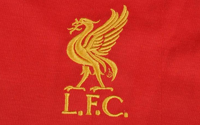 Classic:
 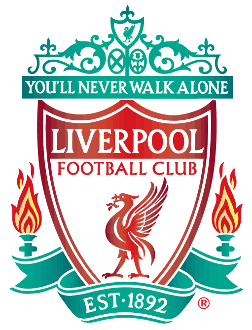 3. Newcastle
The present version is grand, featuring the club's colours, a lion with a flag and two giant seahorses, but it's missing one important detail.
Where's the magpie?
Your team's nickname can't be 'the magpies', if your crest has lions and seahorses but no magpies.
Current:
3. Newcastle
The present version is grand, featuring the club's colours, a lion with a flag and two giant seahorses, but it's missing one important detail.
Where's the magpie?
Your team's nickname can't be 'the magpies', if your crest has lions and seahorses but no magpies.
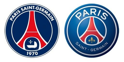
Current: 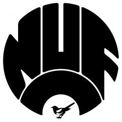 4. PSG
Spot the difference? The updated version, on the right, was launched two years ago and is part of the club's Qatari owners new marketing strategy. Paris is emphasised, but Saint-Germain is relegated to the bottom rung of the crest, and seems an attempt to move away from the club's roots.
PSG was formed through a merger of Paris FC and Stade Saint-Germain in 1970.
Classic & Current:
4. PSG
Spot the difference? The updated version, on the right, was launched two years ago and is part of the club's Qatari owners new marketing strategy. Paris is emphasised, but Saint-Germain is relegated to the bottom rung of the crest, and seems an attempt to move away from the club's roots.
PSG was formed through a merger of Paris FC and Stade Saint-Germain in 1970.
Classic & Current:
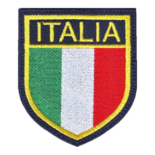
 5. Italy
We know what you're thinking, no Irishman should ever give Italians fashion advice, but there's always an exception, and this it. While the current Azzurri crest is perfectly acceptable, featuring the royal blue of the former Italian monarchy and the colours of the tricolour, it's trying a bit too hard. Less is more, as exemplified by the crest from Euro 2000.
Current:
5. Italy
We know what you're thinking, no Irishman should ever give Italians fashion advice, but there's always an exception, and this it. While the current Azzurri crest is perfectly acceptable, featuring the royal blue of the former Italian monarchy and the colours of the tricolour, it's trying a bit too hard. Less is more, as exemplified by the crest from Euro 2000.
Current: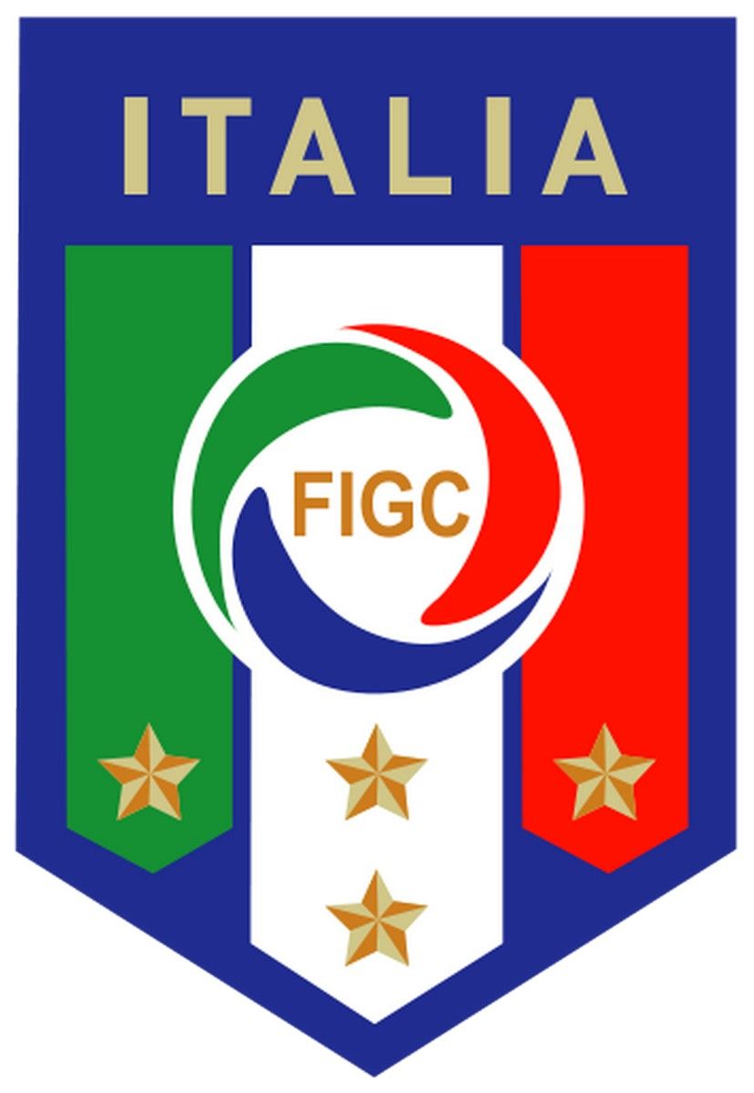 Classic:
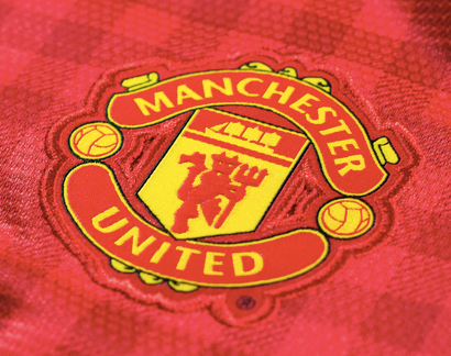
 6. Manchester United
For many football fans, Manchester United are the embodiment of the game's increased commercialisation. The Old Trafford club are a commercial juggernaut, putting their name on everything from crisps to tomato juice, and even have an 'Official office equipment partner'.
A symbol of this commercialisation is, ironically, the club's crest. Whereas it once featured the words 'football club', it was changed in 1998 to the version below still used today.
It was reported in 2013 that the previous crest would be making a comeback, but it has yet to happen.
Current:
6. Manchester United
For many football fans, Manchester United are the embodiment of the game's increased commercialisation. The Old Trafford club are a commercial juggernaut, putting their name on everything from crisps to tomato juice, and even have an 'Official office equipment partner'.
A symbol of this commercialisation is, ironically, the club's crest. Whereas it once featured the words 'football club', it was changed in 1998 to the version below still used today.
It was reported in 2013 that the previous crest would be making a comeback, but it has yet to happen.
Current:
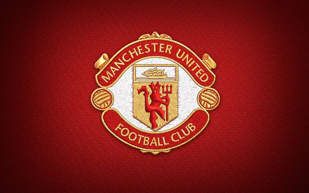
 Classic:
 7. Arsenal
Arsenal's current crest is a bit like the club itself, sleek and fashionable, modern, but with a ode to the past, and expensive looking.
Before you ask why the club would need to change it, have a look at the below effort from the 1950s.
Current:
7. Arsenal
Arsenal's current crest is a bit like the club itself, sleek and fashionable, modern, but with a ode to the past, and expensive looking.
Before you ask why the club would need to change it, have a look at the below effort from the 1950s.
Current: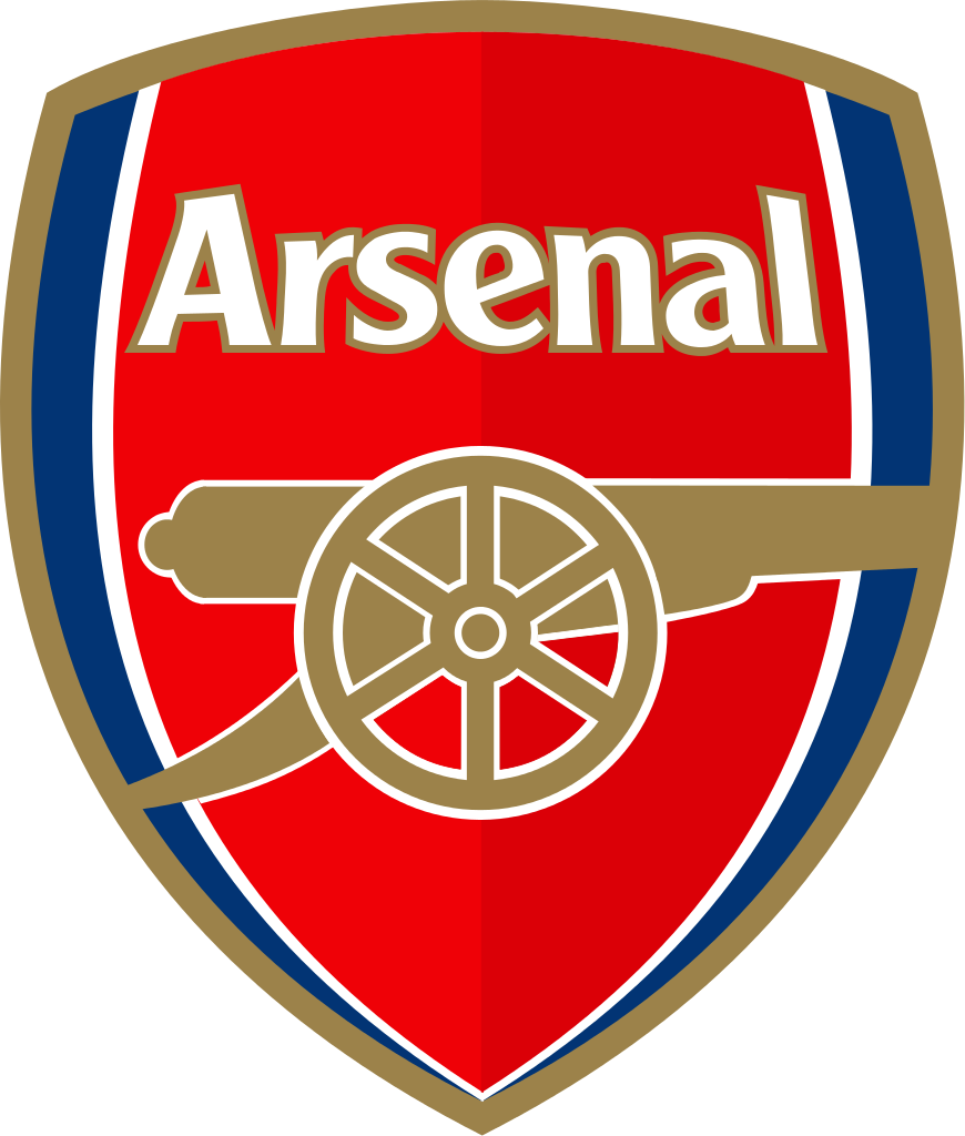 Okay, admittedly there's no canon, it looks like a horseshoe with a mechanical drawing set-square, and it's very angular, but it's so confusing looking it distract opponents.
No? Yeah probably not.
Classic:
Okay, admittedly there's no canon, it looks like a horseshoe with a mechanical drawing set-square, and it's very angular, but it's so confusing looking it distract opponents.
No? Yeah probably not.
Classic:
 8. Notts County
Now that's a magpie...
Current:
8. Notts County
Now that's a magpie...
Current:
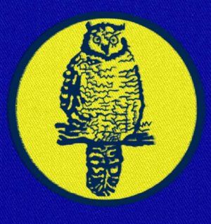
 9. Sheffield United
Would you rather a crest featuring the club's name, foundation date and the symbols of the city and region? Or one with two lads in togas, one holding a shovel and talking to a medieval knight?
Current:
9. Sheffield United
Would you rather a crest featuring the club's name, foundation date and the symbols of the city and region? Or one with two lads in togas, one holding a shovel and talking to a medieval knight?
Current:
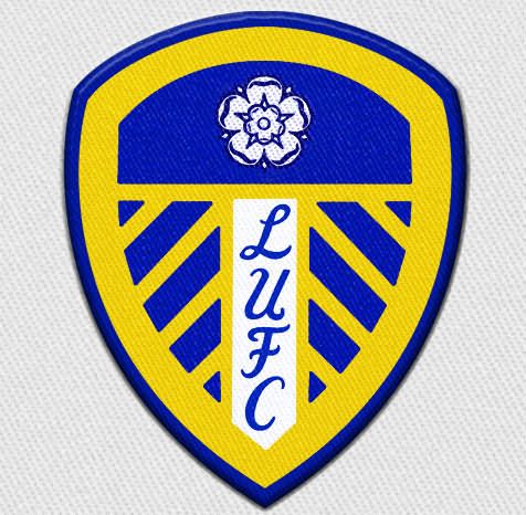
 10. Leeds United
Just try form an argument against a return of Leeds' crest from 1965. It can't be done.
Current:
10. Leeds United
Just try form an argument against a return of Leeds' crest from 1965. It can't be done.
Current:
 Classic:

Football

Football

Football

Football
21-year-old French footballer dies after drowning amid heatwave
RIP. French footballer, Kenzo Kies, has sadly passed away due to a drowning tragedy in the river Rhone. The 21-year-old was with his three friends during the French heatwave where temperatures rose to 40°C in parts of the country this week. Although it is forbidden to swim in the river, Kies and his friends did […]
Football
3 days ago
Quiz: Can you name these iconic World Cup stadiums
This Quiz is sponsored by Lynx, Smell Your Best When You Look Your Worst This quiz is for the real World Cup nerds. We all know the famous players who have graced the best tournament on earth, but can you name the grounds where showed the world their talent? At JOE we pride ourselves on […]
Football
5 days ago

Football
Shamrock Rovers boss hits out at Heimir Hallgrimsson over selection of wonderkid
Football


