Naturally, not everyone will agree with this list.
So, before anyone says anything about what follows, let us assure those of you bothering to read this bit (instead of scrolling down to look at the pictures) that we have extensively researched the football shirts that are most worthy of a place in our list of the 20 greatest football shirts of the 1990s.
By 'extensive research', we mean a 20-minute discussion in our office about which nineties kits we liked the best, followed by a long, drawn out argument to determine the order in which those shirts should be ranked.
You better believe this absolute gem was in the conversation:
Harsh words were exchanged, tears were shed and one person handed in their resignation out of sheer disgust that we'd overlooked Coventry's 1993/94 home shirt, but we got there in the end. After all that, we hope you enjoy it...
20. Ajax - home (1995/1996)
As it is written in the Old Testament:
Thou shalt not compile a list of nice football kits without including something from Ajax. With that in mind, we've stuck this one in from '95/'96 in at number 20.
One of a number of Ajax home shirts from the '90s that was made at least 300% better by the vertical positioning of their shirt sponsor, this was the shirt Umbro created for Ajax's final season at their old
De Meer stadium. In recognition of this, they included the names of club legends on the white part of the shirt.

19. Marseille - home (1991/92)
If you're old enough to remember early '90s football, you'll probably know that adidas churned out a good number of their football shirts using this particular template. With Marseille's colours, however, it was at its best. Not even Chris Waddle's shit haircut could stop it from looking cool.

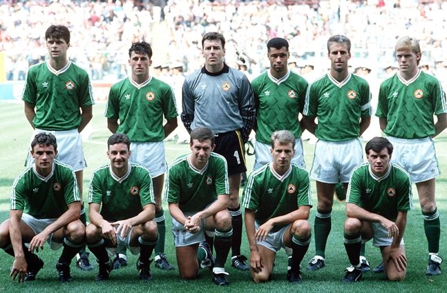
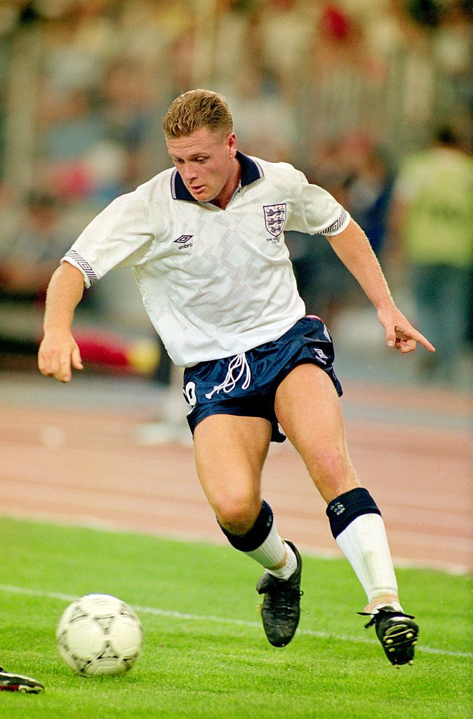
18. England - home (1990/1992)
By no means the most eye-catching England shirt, but certainly one of the more iconic, especially with a big red number 19 on the back. One glance at it is enough (if you're an Englishman) to conjure up memories of Pavarotti belting out
Nessun Dorma, Gazza's tears and a valiant semi-final shoot-out defeat in Turin. A shirt synonymous with a summer when England punched above their weight at a major tournament instead of losing to a country with a population comparable with that of Wigan.
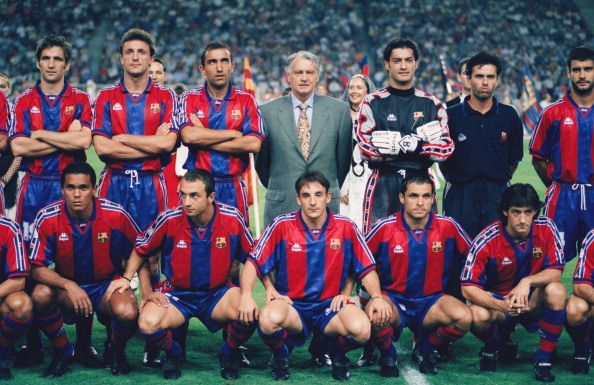
17. Barcelona - home (1995/1997)
As well as producing tracksuit tops for teenagers who spent their Friday and Saturday nights drinking bottles of cheap cider in local parks, Kappa also spent the nineties producing lots and lots of football shirts.
Their cornea-frying Barcelona away designs were certainly more memorable, but this home shirt - worn by Sir Bobby Robson's Barca - was actually really good. So good, in fact, that every kid who went on holiday to Mallorca during that time came back with a fake version of it.
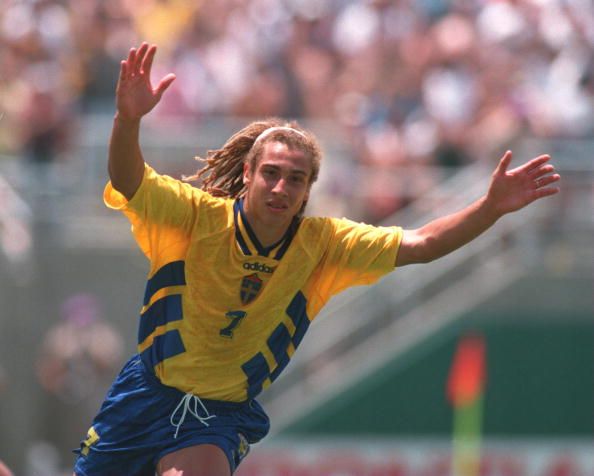
16. Sweden - home (1994/1996)
Sweden weren't the only team at the 1994 World Cup with this particular design of shirt. adidas' kit designers were economical when it came to getting the most out of their templates, but this one worked particularly well with the Swedes' yellow and blue colour scheme.
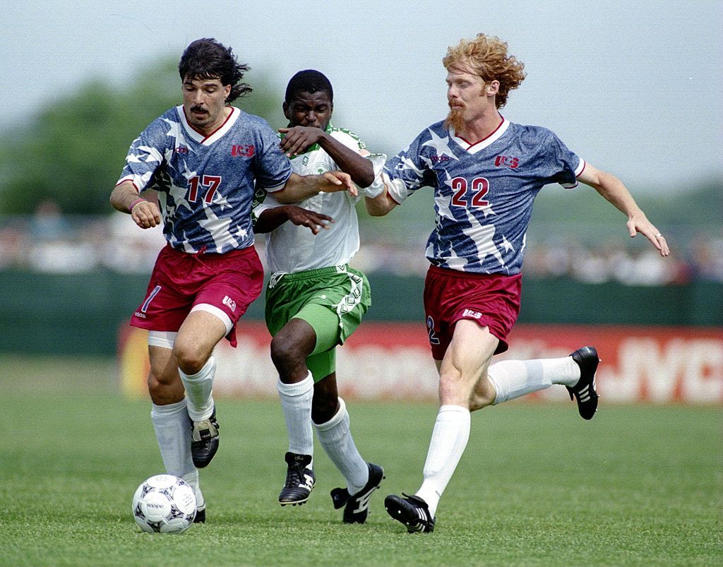
15. USA - away (1994)
As hosts of the '94 World Cup, America had extra incentive to get all patriotic when it came to their kit designs. Not that they ever need an excuse.
While their home shirt drew inspiration from the red and white stripes of their national flag, this away offering featured its stars. Oh, and just to make it all the more memorable, they also included a denim-style background, too.
Probably not everyone's cup of tea, but for its boldness alone, we think it's worthy of its place.
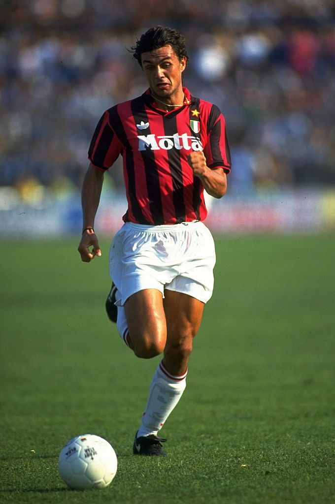
14. AC Milan - home (1992/93)
A true classic, this.
Provided you can divert your eyes away from Paolo Maldini's impossibly handsome face for long enough, take a minute to appreciate this AC Milan shirt. The final shirt of adidas' first stint as their kit supplier, arguably the finest Milan shirt of the lot. Simply beautiful, just like Paolo.
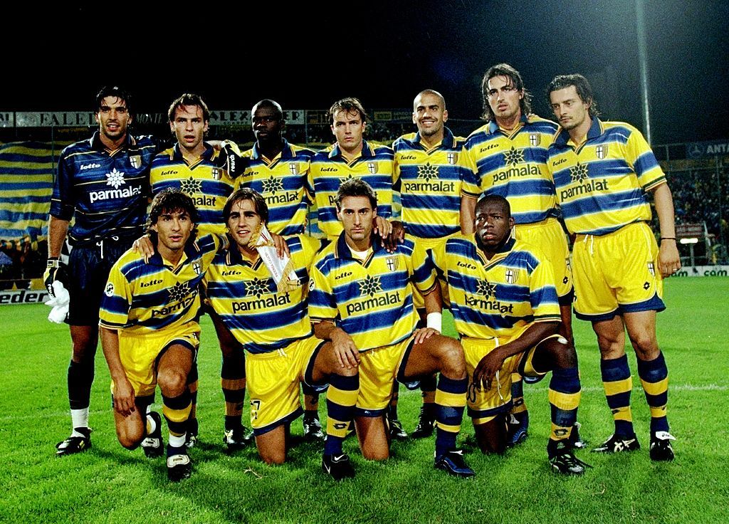
13. Parma - home (1998/1999)
You've probably seen the picture below at some point below.
While plenty of generic football Twitter accounts like to use it when they throw out that same tweet about how good Parma's team used to be, we can't help feeling that the loveliness of their football shirts is overlooked.
This Lotto one, worn by Parma towards the end of the nineties, was the best of the bunch.
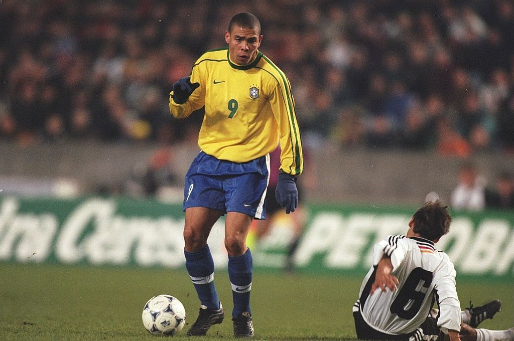
12. Brazil - home (1998/2000)
It didn't quite work out for Brazil at France 1998, thanks largely to Ronaldo's funny turn before the final. While they'd lose their crown in Paris that night, they can at least take comfort in the fact that the kit they wore was, in the opinion of a few people in the office, much better than the one they wore when they lifted the trophy in 1994.
Nike took over from Umbro as the Seleçao's kit suppliers in between the two tournaments, producing a much more simple, slick design for their title defence. They also made that really cool airport advert, which almost certainly made people want to buy this shirt even more.
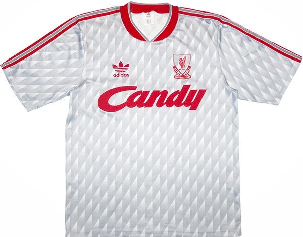
11. Liverpool - away (1989/1991)
As some smart arse will inevitably point out, this shirt first appeared in the eighties. That said, Liverpool wore it for two years, which means we're having it in our list whether you like it or not.
A few years before Manchester United players revealed to the world that grey kits made the players wearing them perform badly, Liverpool were rocking this beauty. An instant classic, it also inspired their '08/'09 away strip - one which, ironically, they wore when beating United 4-1 at Old Trafford.
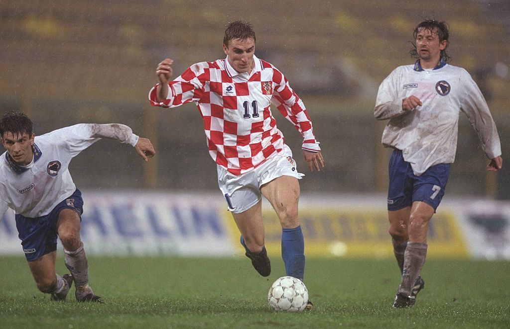
10. Croatia - home (1996)
Euro '96 was a big deal for Croatia. Their first major football tournament since their independence from Yugoslavia, this red and white chequered design was a big hit.
Yeah, more or less every Croatian shirt since has looked pretty much *exactly the same* but at the time, this was unique.
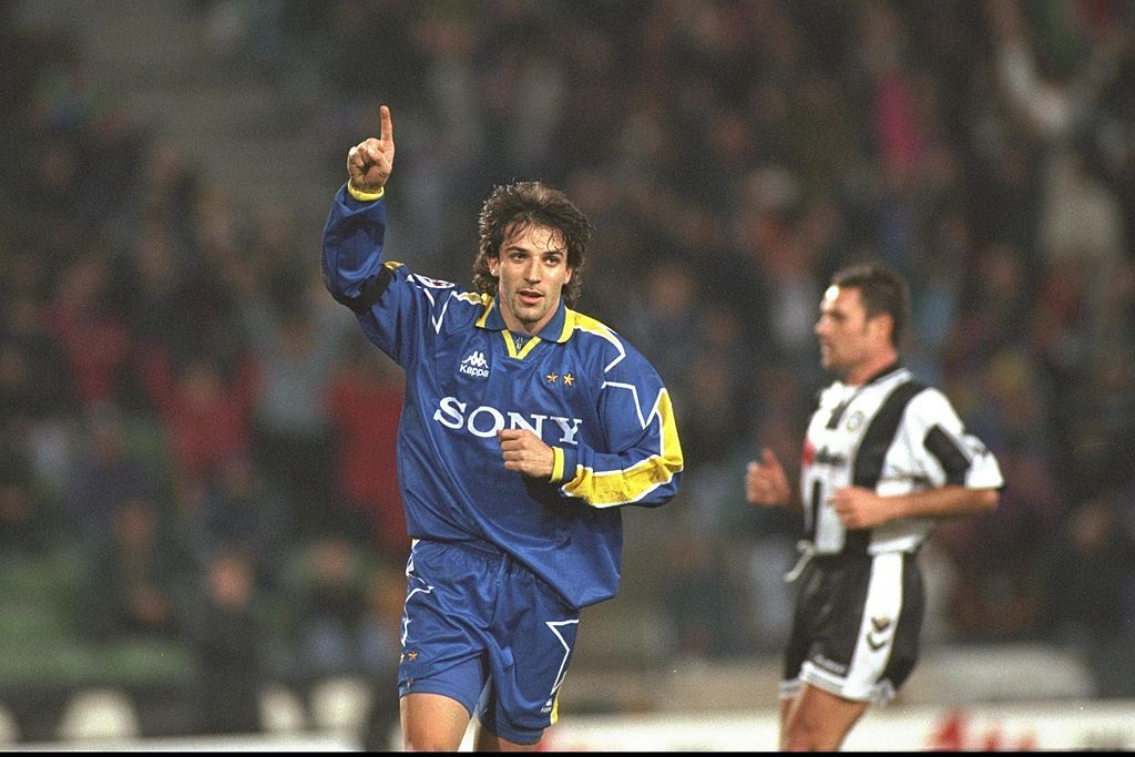
9. Juventus - away (1995/1997)
Juve won and lost Champions League finals wearing this beauty, making it quite a memorable kit all round.
Predominantly blue with a yellow trim, the shirt was made all the more cool by the fact Sony - at a time when the electronics company made
Walkmen and Mini Disc players - was plastered across its front.
8. Manchester United - away (1993/1995)
Would this shirt be quite as well remembered were it not for Eric Cantona going studs up on an abusive Crystal Palace supporter? Probably not. Either way, this is a lovely shirt.
Having experimented with a green and yellow third shirt as a nod to United's beginnings as Newton Heath, Umbro ditched the idea of honouring the club's past when they brought out this away shirt a year later. Mainly black with a gold and blue trim, we've decided that this pips the European kit of '98/'00 as United's most aesthetically pleasing strip of the decade. Don't agree? Deal with it.

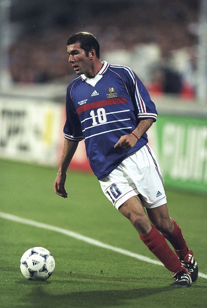
7. France - home (1998)
To be fair, as much as we love this shirt, it's not
really a nineties design. Aside from the addition of the white collar, this shirt was largely identical to the one worn by the French when they triumphed at Euro '84. 14 years on, they wore this shirt as they hosted and won another major football tournament, seeing off pre-tournament favourites Brazil in the World Cup final of 1998.
The red and white horizontal stripes across its front, the way in which adidas weaved the French tricolour flag between their own three stripes which ran down its sleeves... and the fact that Zinedine Zidane enjoyed his finest footballing hour while wearing it, make this one of our favourites.
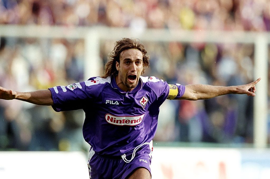
6. Fiorentina - home (1998/1999)
Purple football shirts shouldn't work, especially purple football shirts with long, slightly baggy sleeves. That said, Fiorentina's home shirt for the late nineties was lovely.
The addition of Nintendo as the main sponsor worked too, complimenting the red Fleur-de-lis seen in the club's crest and on the shirt's shoulders.
The fact that Gabriel Batistuta scored thunderbastard after thunderbastard while wearing it also makes us love it a bit more, too.
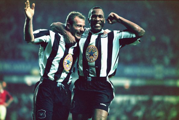
5. Newcastle United - home (1995/97)
Sorry Juventus. This top 20 kits of the nineties countdown only has room for one black and white striped design, and it's not one of yours.
Instead, we've gone for this, worn by Newcastle's title-challenging sides of the mid nineties. They might not have won anything while wearing it, but this shirt is synonymous with some of the most exciting football played in the Premier League era.
Not only was its crisp, simple design a big hit, the fact that it featured Newcastle Brown Ale's logo - a local company - on its front went perfectly with the fact that this was the shirt first worn by Alan Shearer after returning to his hometown to spearhead Newcastle's attempts to land the title.
4. Arsenal - away (1991/93)
Well we couldn't
not include this one, could we?
Of all the many yellow away kits Arsenal have worn down the years, this has to be the coolest of the lot. Look, even a receding Steve Bould looks magnificent in it.

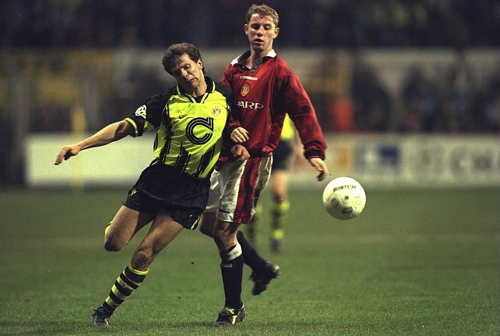
3. Borussia Dortmund - European home (1996/97)
Borussia Dortmund turned out in this luminous European home shirt on their march to Champions League glory in 1997.
Nike got this one spot on, toning down the high-vis colour and adding plenty of black trim. The addition of the large letter C in its centre - representing their shirt sponsor, Die Continentale - also made this one of the finest shirts of the decade.
2. Sampdoria - home (1992-93)
Lets face it, this was *always* going to be up there. The kind of shirt that football hipsters would willingly have sex with, there's no denying that this is one of the more memorable designs of 1990s Italian football.
Azure blue with Sampdoria's traditional white red and black band running horizontally through its middle, this shirt broke the mould when it came to the positioning of shirt sponsorship and club crests, and we loved it all the more for doing so.
In our opinion at least, the second best football shirt of the entire decade.

1. West Germany - home (1990/92)
Okay, okay... we get it. You've bothered to scroll all the way down to the bottom of this, probably just looking at pictures and not bothering to read the writing, and now you're hit with the news that we reckon Germany, a team that you most probably don't like when it comes to international football, have worn the best shirt of the nineties. You're probably unhappy. So unhappy, you might even leave us a strongly worded Facebook comment or tweet.
But please, let's just get over the fact that this is a
German shirt. It's bloody magnificent.

Essentially, it's one of those white and black adidas Originals t-shirts that the cool kids like to wear nowadays, only with the three colours of the Bundesflagge cutting their way across its chest and over its shoulders and leaving all but four diamond shaped holes of white. A shirt so lovely, not even the most German of hairstyles can detract from it...

Like it or not, that's our nummer eins.
Don't agree? Of course you don't agree.
Let us know which shirts you'd have included in this in the comments on Facebook or by blasting us an alternative on Twitter.


