


Football
Share
Published 16:55 17 May 2016 BST
Explore more on these topics:
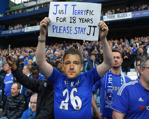 There's a lot going on in this photo so, it may be a big ask, but we're going to ask you to ignore the backwards jersey and the creepy John Terry mask and focus solely on the sign.
The pun cannot be ignored. 'Terryfic' simply doesn't scan at all. Not to mention the fact that if you didn't quite get the "play on words", the supporter has kindly pummeled it into a bloodied, cowering mess by putting the Terry part in blue.
And look! The J and T in 'Just' are capitalised also in blue... JusT like his initials.
How clever!
If a car crash and a trainwreck mated...
https://twitter.com/James_Dart/status/678250062825287681?ref_src=twsrc%5Etfw
"Iazzard"? "Cesl"? Who are these strange characters you speak of? Are they two of the three "bats"?
Luckily, this genius had no faith in his spelling so decided to put the three players' numbers in some form of inverted commas that must have originated from an alien planet.
Come on now.
https://twitter.com/NotoriousBD/status/683387772447649793?ref_src=twsrc%5Etfw
Putting hashtags on a sign won't make them trend on Twitter.
Nor will putting a player's name you like on some inkjet be enough to convince your manager that he's the answer to all your team's problems.
"Hashtag Wanyama, you say? Get Koeman on the phone."
Poor child.
There's a lot going on in this photo so, it may be a big ask, but we're going to ask you to ignore the backwards jersey and the creepy John Terry mask and focus solely on the sign.
The pun cannot be ignored. 'Terryfic' simply doesn't scan at all. Not to mention the fact that if you didn't quite get the "play on words", the supporter has kindly pummeled it into a bloodied, cowering mess by putting the Terry part in blue.
And look! The J and T in 'Just' are capitalised also in blue... JusT like his initials.
How clever!
If a car crash and a trainwreck mated...
https://twitter.com/James_Dart/status/678250062825287681?ref_src=twsrc%5Etfw
"Iazzard"? "Cesl"? Who are these strange characters you speak of? Are they two of the three "bats"?
Luckily, this genius had no faith in his spelling so decided to put the three players' numbers in some form of inverted commas that must have originated from an alien planet.
Come on now.
https://twitter.com/NotoriousBD/status/683387772447649793?ref_src=twsrc%5Etfw
Putting hashtags on a sign won't make them trend on Twitter.
Nor will putting a player's name you like on some inkjet be enough to convince your manager that he's the answer to all your team's problems.
"Hashtag Wanyama, you say? Get Koeman on the phone."
Poor child.
 Nothing wrong with the sign itself, it's actually quite heartfelt and sweet. The issue we have is the message it conveys.
A fourth generation Spurs fan? Get ready for a lot of heartbreak and disappointment. Talk about tough parenting/grand-parenting/great-grand-parenting.
A little effort goes a long way.
Nothing wrong with the sign itself, it's actually quite heartfelt and sweet. The issue we have is the message it conveys.
A fourth generation Spurs fan? Get ready for a lot of heartbreak and disappointment. Talk about tough parenting/grand-parenting/great-grand-parenting.
A little effort goes a long way.
 The bare minimum amount of effort goes nowhere.
It's the hope that kills them.
The bare minimum amount of effort goes nowhere.
It's the hope that kills them.
 It's highly doubtful, but we're all pulling for you.
Good concept, but...
It's highly doubtful, but we're all pulling for you.
Good concept, but...
 Want to know why Louis van Gaal wasn't given the sack when this sign was made? The form was rendered null and void by this maverick approach to the block capitals rule. (Don't say we didn't warn you that we were pedants.)
Right...
Want to know why Louis van Gaal wasn't given the sack when this sign was made? The form was rendered null and void by this maverick approach to the block capitals rule. (Don't say we didn't warn you that we were pedants.)
Right...
 If you really wanted him to stay, you would have made the sign a lot bigger and finished colouring it in. Unless Roman Abramovich has a NASA-grade telescope with him in the corporate box, he won't be seeing your message.
More effort.
If you really wanted him to stay, you would have made the sign a lot bigger and finished colouring it in. Unless Roman Abramovich has a NASA-grade telescope with him in the corporate box, he won't be seeing your message.
More effort.
 A product of the Vine generation. If it can't be done in six seconds or less, what's the point of even trying?
You can't help but feel sorry for this poor chap for falling for the most common sign-making problem that everyone has experienced. He went too big with the letters at the start of each line and then had to overcompensate by severely reducing the letter size towards the end of each line.
Impressively, it happened to him, not once, not twice but thrice.
Just embarrassing.
https://twitter.com/DeejayDt/status/726727192164601858
You stay classy, Arsenal "fans".
A product of the Vine generation. If it can't be done in six seconds or less, what's the point of even trying?
You can't help but feel sorry for this poor chap for falling for the most common sign-making problem that everyone has experienced. He went too big with the letters at the start of each line and then had to overcompensate by severely reducing the letter size towards the end of each line.
Impressively, it happened to him, not once, not twice but thrice.
Just embarrassing.
https://twitter.com/DeejayDt/status/726727192164601858
You stay classy, Arsenal "fans".


Football

Football

Football

Football
21-year-old French footballer dies after drowning amid heatwave
RIP. French footballer, Kenzo Kies, has sadly passed away due to a drowning tragedy in the river Rhone. The 21-year-old was with his three friends during the French heatwave where temperatures rose to 40°C in parts of the country this week. Although it is forbidden to swim in the river, Kies and his friends did […]
Football
3 days ago
Quiz: Can you name these iconic World Cup stadiums
This Quiz is sponsored by Lynx, Smell Your Best When You Look Your Worst This quiz is for the real World Cup nerds. We all know the famous players who have graced the best tournament on earth, but can you name the grounds where showed the world their talent? At JOE we pride ourselves on […]
Football
5 days ago

Football
Shamrock Rovers boss hits out at Heimir Hallgrimsson over selection of wonderkid
Football


