


Football
Share
Published 15:09 5 Aug 2016 BST
Explore more on these topics:
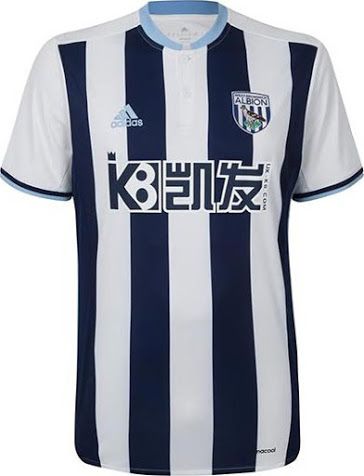
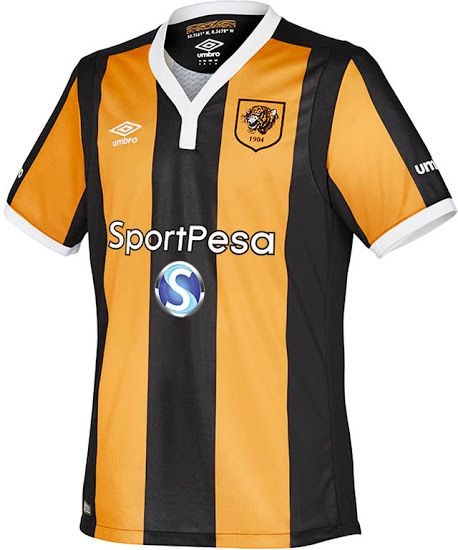 19 - West Brom
Tony Pulis spent too much time drilling set piece defences and not enough time communicating with adidas. Either go with a navy adidas logo and put it over a white stripe or use a white logo over a navy stripe. Don't plant it smack dab between stripes so it's barely legible. Nothing stands out except for the screaming sponsor on the midriff.
19 - West Brom
Tony Pulis spent too much time drilling set piece defences and not enough time communicating with adidas. Either go with a navy adidas logo and put it over a white stripe or use a white logo over a navy stripe. Don't plant it smack dab between stripes so it's barely legible. Nothing stands out except for the screaming sponsor on the midriff.
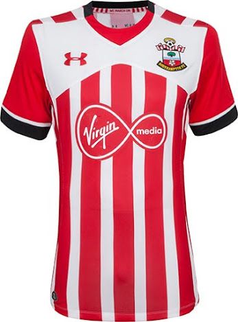
 18 - Southampton
They took a risk. It did not pay off! The white section on the chest just doesn't make sense and, again, this one is let down by a pesky sponsor that resembles a sticker that runners slap on their chest during marathons.
18 - Southampton
They took a risk. It did not pay off! The white section on the chest just doesn't make sense and, again, this one is let down by a pesky sponsor that resembles a sticker that runners slap on their chest during marathons.
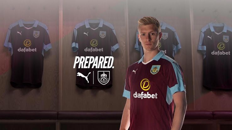
 17 - Burnley
There's nothing wrong with it but it's just not the snugly-fitted Puma jerseys we've come to love. If we were being nit-picky, we'd criticise the way that the trim on the sleeves blends into the blue of the collar. Just about stays afloat in the completely non-existent jersey relegation battle.
17 - Burnley
There's nothing wrong with it but it's just not the snugly-fitted Puma jerseys we've come to love. If we were being nit-picky, we'd criticise the way that the trim on the sleeves blends into the blue of the collar. Just about stays afloat in the completely non-existent jersey relegation battle.
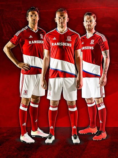
 16 - Middlesbrough
It's like the guy who was pitching the kit design had it all drawn up but, before going into the boardroom, the 'Boro chairman said "hopefully it's a little bit unique," and the design lad panicked and threw a bit of toilet paper around his original idea.
16 - Middlesbrough
It's like the guy who was pitching the kit design had it all drawn up but, before going into the boardroom, the 'Boro chairman said "hopefully it's a little bit unique," and the design lad panicked and threw a bit of toilet paper around his original idea.
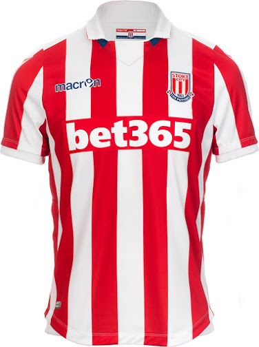
 15 - Stoke
Robust enough to last on those famous cold, windy nights at the Britannia but it's remarkably unremarkable. There's nothing offensive enough to send it to the jersey Championship but nothing that stands out enough to rate it anywhere near the top 10.
15 - Stoke
Robust enough to last on those famous cold, windy nights at the Britannia but it's remarkably unremarkable. There's nothing offensive enough to send it to the jersey Championship but nothing that stands out enough to rate it anywhere near the top 10.
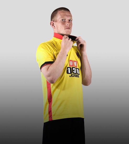
 14 - Watford
Yellow is difficult. You wouldn't call it unlike Pikachu.
14 - Watford
Yellow is difficult. You wouldn't call it unlike Pikachu.
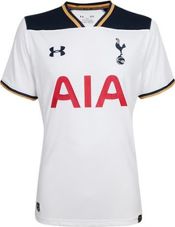
 13 - Spurs
The gold trim, presumably used to signify glory looks more like the gold you'd find casing chocolate coins. Except unlike the goodness hidden under the foil, all there is here is an underwhelming jersey that we will not be buying.
13 - Spurs
The gold trim, presumably used to signify glory looks more like the gold you'd find casing chocolate coins. Except unlike the goodness hidden under the foil, all there is here is an underwhelming jersey that we will not be buying.
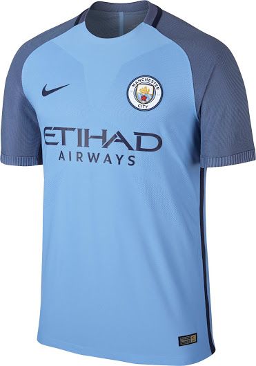
 12 - Manchester City
Nike are getting rather lazy and just using stock templates, changing the colours and shipping them out as new kits. Well we're on to you, Nike. The colours are nice but it looks too much like a Pro Evo graphic of a kit for our liking.
12 - Manchester City
Nike are getting rather lazy and just using stock templates, changing the colours and shipping them out as new kits. Well we're on to you, Nike. The colours are nice but it looks too much like a Pro Evo graphic of a kit for our liking.
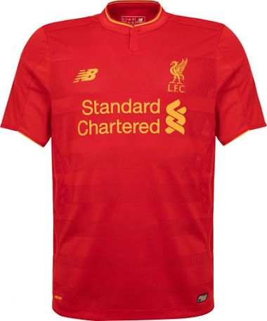
 11 - Liverpool
Not a sight for sore eyes or anything like that but the sponsor, crest and New Balance logo are all too cramped on the chest. It's the little details that matter as we approach the top 10.
11 - Liverpool
Not a sight for sore eyes or anything like that but the sponsor, crest and New Balance logo are all too cramped on the chest. It's the little details that matter as we approach the top 10.
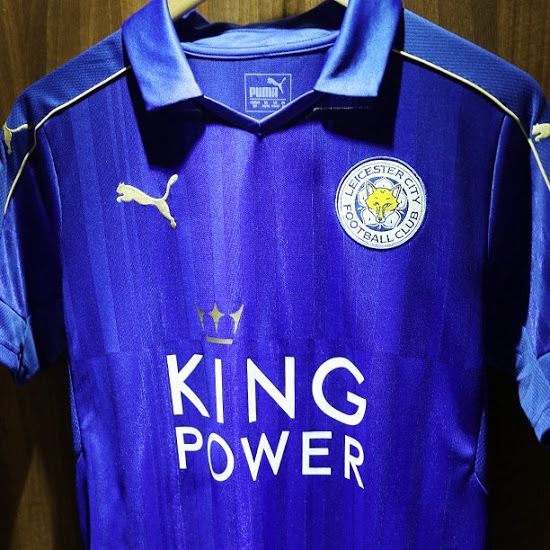
 10 - Leicester
That kit, get banged. For some mad reason, they just overdid the shiny factor. Perhaps they went with a wipe-clean fabric to get all that tomato sauce off when the Foxes players are rewarded with pizzas next season.
10 - Leicester
That kit, get banged. For some mad reason, they just overdid the shiny factor. Perhaps they went with a wipe-clean fabric to get all that tomato sauce off when the Foxes players are rewarded with pizzas next season.
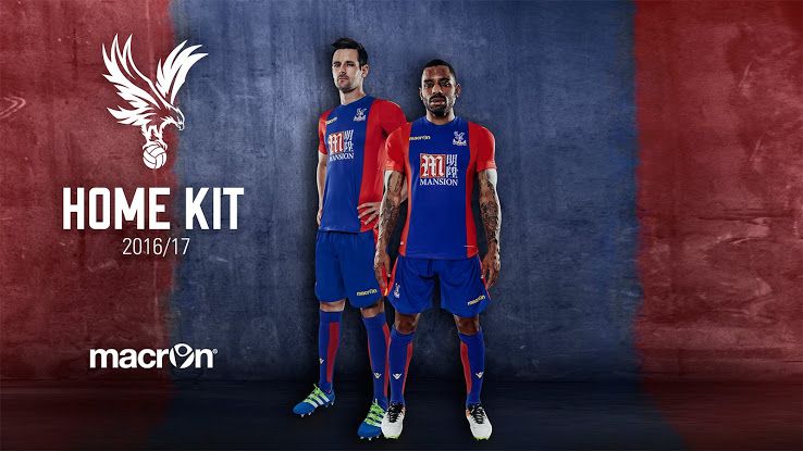
 9 - Crystal Palace
It's hard to screw up red and blue. Classy enough to be deserving of being pulled on by Yannick Bolasie... not quite classy enough to be worn by Alan Pardew when he goes out clubbing.
9 - Crystal Palace
It's hard to screw up red and blue. Classy enough to be deserving of being pulled on by Yannick Bolasie... not quite classy enough to be worn by Alan Pardew when he goes out clubbing.
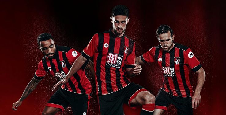
 8 - Bournemouth
The most visually inoffensive of the Mansion lot, there's nothing too fancy about the Cherries' number. Black and red stripes with a bit of white thrown in to break it up.
8 - Bournemouth
The most visually inoffensive of the Mansion lot, there's nothing too fancy about the Cherries' number. Black and red stripes with a bit of white thrown in to break it up.
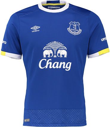
 7 - Everton
Just a classic, with a bit of yellow to make it seem like you're buying an entirely new piece of clothing. It's nice though, isn't it?
7 - Everton
Just a classic, with a bit of yellow to make it seem like you're buying an entirely new piece of clothing. It's nice though, isn't it?
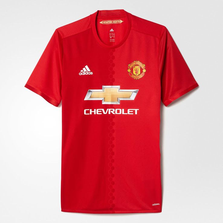
 6 - Manchester United
Two tones of red, a beautiful design separating the lighter and darker shades on the front and just wonderfully understated.
6 - Manchester United
Two tones of red, a beautiful design separating the lighter and darker shades on the front and just wonderfully understated.
 5 - Chelsea
This will look fantastic when it's hanging off Diego Costa after he throws himself into a shirt-tearing bout of handbags. The decision to litter lions across the front of the home shirt seems mad on paper but it works. The subtle mesh on the back looks gorgeous and will stop John Terry from getting too warm when he wears it under his matchday suit next May.
5 - Chelsea
This will look fantastic when it's hanging off Diego Costa after he throws himself into a shirt-tearing bout of handbags. The decision to litter lions across the front of the home shirt seems mad on paper but it works. The subtle mesh on the back looks gorgeous and will stop John Terry from getting too warm when he wears it under his matchday suit next May.
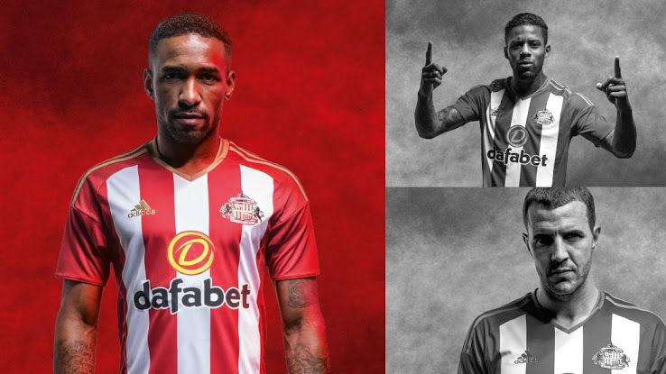
 4 - Sunderland
Screenshot it, Black Cats fans! Because you're actually in the top five of a table. Moyesy can't take the credit for it but we wouldn't be surprised if former manager Sam Allardyce brazenly applauds himself for playing some part. He's arrogant. Get it?
4 - Sunderland
Screenshot it, Black Cats fans! Because you're actually in the top five of a table. Moyesy can't take the credit for it but we wouldn't be surprised if former manager Sam Allardyce brazenly applauds himself for playing some part. He's arrogant. Get it?
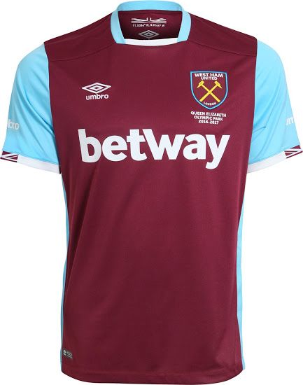
 3 - West Ham
This screams retro. The traditional West Ham colours blend particularly well for the coming season and the new badge is just fantastic. A jersey fitting of Dimitri Payet.
3 - West Ham
This screams retro. The traditional West Ham colours blend particularly well for the coming season and the new badge is just fantastic. A jersey fitting of Dimitri Payet.
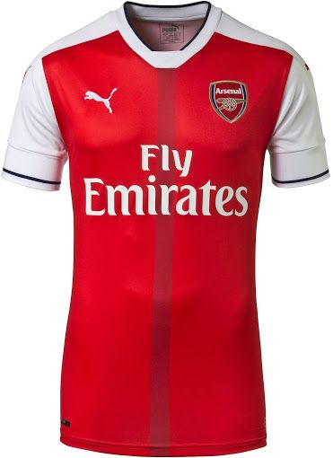
 2 - Arsenal
Arsenal gonna Arsenal. They've nailed the whole tight-fitting Puma look and they've made many a five-a-side player appear to have much bigger arms than they actually do. A classic colour scheme with a splash of originality thrown in with the wine stripe down the centre. Could wear it to a bloody wedding.
2 - Arsenal
Arsenal gonna Arsenal. They've nailed the whole tight-fitting Puma look and they've made many a five-a-side player appear to have much bigger arms than they actually do. A classic colour scheme with a splash of originality thrown in with the wine stripe down the centre. Could wear it to a bloody wedding.
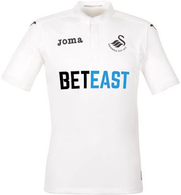
 1 - Swansea
Well would you look at that! All it takes is a plain, far-from-elaborate white design with a clever splash of blue on the sponsor and we're won over. The crest is beautiful and the JOMA logo simply fits. It's perfect.
1 - Swansea
Well would you look at that! All it takes is a plain, far-from-elaborate white design with a clever splash of blue on the sponsor and we're won over. The crest is beautiful and the JOMA logo simply fits. It's perfect.
 Complaints on a postcard!
Dublin v Donegal and Mayo v Tyrone previewed in the GAA Hour. Subscribe here on iTunes.
https://soundcloud.com/sportsjoe-gaa-hour/michael-murphy-on-enjoying-the-game-duffys-flawed-proposal
Football

Football

Football

Football
Shamrock Rovers boss hits out at Heimir Hallgrimsson over selection of wonderkid
Interesting… Shamrock Rovers manager, Stephen Bradley, has criticised the inclusion of one of his young stars in Ireland’s recent friendly camp in May. Ireland played Qatar and Canada in what was intended to be World Cup warm-up games for the ongoing North-American tournament. Although, meaningless games, Heimir Hallgrimsson was able to showcase the talent that […]
Football
1 day ago
Quiz: Can you name every manager since 1998 to win the World Cup
Tricky… Okay so we all know you can name World Cup winning captains. And with the North-American tournament finally underway, new legends will be created this summer. Can you name every World Cup winning gaffer since 1998? Best of luck and let us know how you get on!
Football
1 day ago

Football
32 is the score to beat in our World Cup legends quiz
Football


